what is vans family program?
Vans Family program is a recent application launched by Vans off the wall. This is a conceptual application that could be installed in iOS device. It was intended to seamlessly integrate and improve some features that is the product lacking.
Based on the research, A/B testing, goals, usability, and solutions I was able to improve and reimagine a rewards program with more intuitive features.
10.01.2019 - 11.01.2019 (one month)
Competitive Analysis Research
In this research I conducted a competitive analysis, compared different interaction models, and studied best retail reward programs. Moreover, as a current sales supervisor at vans I was able to utilized feedback from customers to help my design and UX choices choices through out the process.
Quantitative & Qualitative Data
In this early part of the process I was able to collect quantitative and qualitative data from 5 participants. Once the data was collected, the tasks, actions and observations were divided to analyze and compare the struggles the user may or may not have encountered while completing the given tasks. At this point the main pain points have to be extracted from the experience map in order to come up with a set of goals and metrics.
Pain Points, Goals, & Metrics
The pain points extracted from the experience map were mainly focused on adding the online section just like other big retail companies like UO, Adidas, and Nike have done. Moreover, a better visualization of points, prizes, challenges and organization by adding filter/sort access.
The next step was creating four personas with different attributes, goals, concerns , and quotes in order to support the user experience process.
The next step was creating four personas with different attributes, goals, concerns , and quotes in order to support the user experience process.
The next step was creating four personas with different attributes, goals, concerns , and quotes in order to support the user experience process.
After using the pain points and goals, the user showed more interest in the rewards part rather than the profile. Therefore, I had to make adjustments to the "Point Tracker" section. Moreover, the user desired more interactivity and including an online feature to make purchases.
This was my initial round and tested a variety of interface styles using different concepts to make the task easier and understanding. The participants followed up and liked the new interaction and features. Although it was challenging to explain in detail the high-fidelity features with low-fidelity I was able to receive valuable feedback.
Four scenarios and storyboards were created based on personas, pain points, and goals. These four scenarios show the possible interactions from the user and application. Moreover, the scenarios and storyboard demonstrate the goals and solutions that the user may encounter.
This was my initial round and tested a variety of interface styles using different concepts to make the task easier and understanding. The participants followed up and liked the new interaction and features. Although it was challenging to explain in detail the high-fidelity features with low-fidelity I was able to receive valuable feedback.
After making the adjustments on the previous prototypes, in this case, I was able to test the paper prototypes with a Vans employee, Jack Hubbard. In this situation, I gave the user multiple tasks to complete. This allowed me to see if the interface was intuitive.
During the given tasks, I noticed a couple pain points that the user encountered. These were mainly focused on the online shopping section, struggle to recognize some Menu icons, and the organization of the merchandise, events, rewards, contests, and more. This usability test helped to Target the areas to maximize the usability of the application program.
During the given tasks, I noticed a couple pain points that the user encountered. These were mainly focused on the online shopping section, struggle to recognize some Menu icons, and the organization of the merchandise, events, rewards, contests, and more. This usability test helped to Target the areas to maximize the usability of the application program.
In this part of the process I was able to get valuable feedback from users by using the poll platform installed in instagram. In this case, over 90 users took part of the A/B Testing for icons.
In this part of the process I was able to get valuable feedback from users by using the poll platform installed in instagram. In this case, over 90 users took part of the A/B Testing for icons.
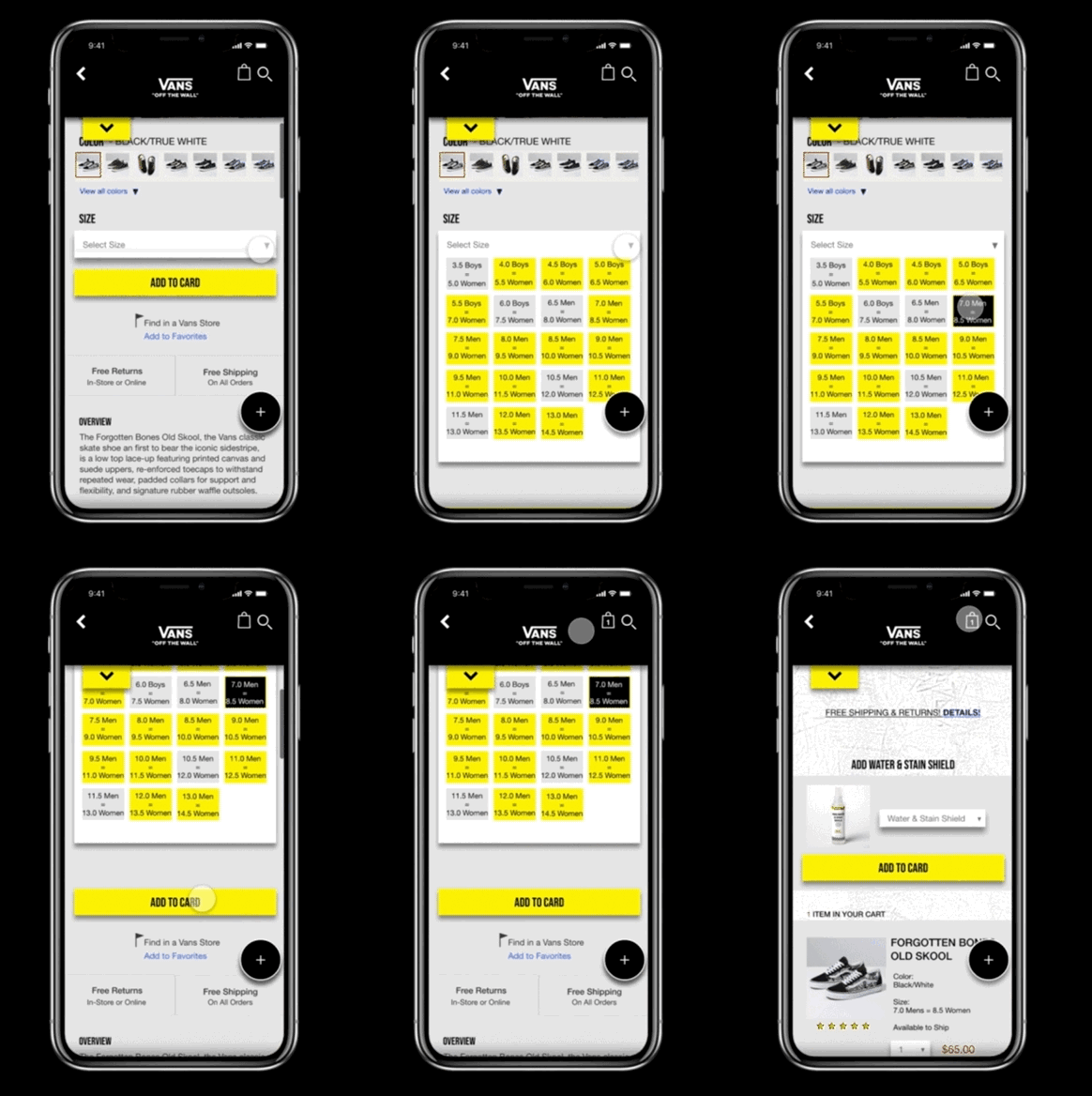
Interactive Shopping Bag & Animation
In this part of the process I was able to get valuable feedback from users by using the poll platform installed in instagram. In this case, over 90 users took part of the A/B Testing for icons.
After the second round of usability, the new high-fidelity wireframes included new improvements but after getting more feedback, the user found the color harmful for the eyes after awhile. Therefore, I had to change the color for the interface.
After the second round of usability, the new high-fidelity wireframes included new improvements but after getting more feedback, the user found the color harmful for the eyes after awhile. Therefore, I had to change the color for the interface.
After receiving more feedback from the users, I was able to continue to make the new adjustments and attempt to make a more cohesive product. I chose the following colors to make the interface less harmful to user and legible for the human eye. This will improve and make the product comfortable to utilize for longer period time.
Vans Family Final Version
After receiving more feedback from the users, I was able to continue to make the new adjustments and attempt to make a more cohesive product. I chose the following colors to make the interface less harmful to user and legible for the human eye. This will improve and make the product comfortable to utilize for longer period time.
After receiving more feedback from the users, I was able to continue to make the new adjustments and attempt to make a more cohesive product. I chose the following colors to make the interface less harmful to user and legible for the human eye. This will improve and make the product comfortable to utilize for longer period time.
After receiving more feedback from the users, I was able to continue to make the new adjustments and attempt to make a more cohesive product. I chose the following colors to make the interface less harmful to user and legible for the human eye. This will improve and make the product comfortable to utilize for longer period time.
Why Download Vans Family Program?
The new application has new features and interface that is more intuitive to the user. It is now easier to keep track of the user's and special events or contests. That being said, the new application is simpler and better than before.
How does the new program work?
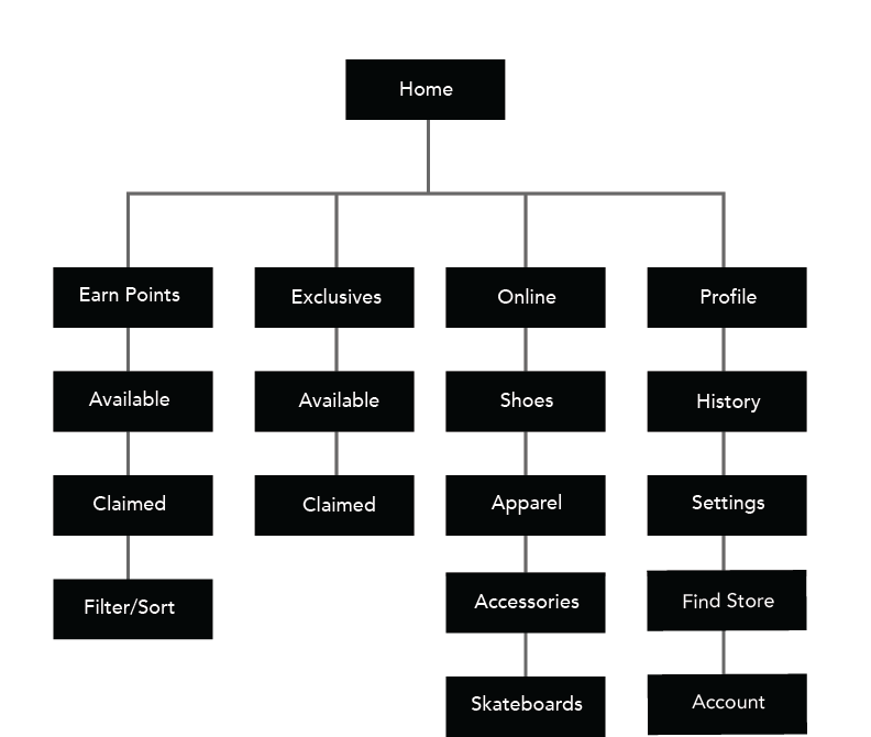
The user has to create an account or log in in order to be part of the rewards. However, the program has been enhanced by adding a new interface for the tracking points, events, and contests. Moreover, the user will be able to make online orders to facilitate the transition from shopping to redeeming points.
A new feature is located on top left side corner works as a point and redeem tracker. This will allow the user to keep in track of their points so the company increases awareness among customersAlso the find store icon has been placed in the point tracker section in order to locate the nearest store and find out its availability. Moreover a new modern menu interface has been added to replace the older side menu. This modern approach was mainly to keep up to the customer's current trends and expectations from companies like, Adidas, UO, and Converse.
The amount of contests, challenges, and events was pretty overwhelming therefore a new featured has been added, "filter/sort". In this case the user has access to categorize their interests by filtering the categories and sort the points.
After receiving more feedback from the users, I was able to continue to make the new adjustments and attempt to make a more cohesive product. I chose the following colors to make the interface less harmful to user and legible for the human eye. This will improve and make the product comfortable to utilize for longer period time.
After receiving more feedback from the users, I was able to continue to make the new adjustments and attempt to make a more cohesive product. I chose the following colors to make the interface less harmful to user and legible for the human eye. This will improve and make the product comfortable to utilize for longer period time.
The user now is able to update their ID with a personal image that can be displayed. Additionally, the profile section has history of points and orders, find a store, and personal settings such as change of password, reviews, and email.
What is the new and improved application solving?
The application is solving one of the biggest pain points found during the research process, the addition of the online shopping experience.During the interviews and usability tests, the participants found this as a big obstacle in the user's experience since they had to leave the application to the native website to do make the online orders. The other features that were secondary to the enhancement of this product were the point tracker, store finder, profile and filter/sort product.
What does this app include?
I decided to include the following features to maximize the usability of the application. These were the most demanded features during the research and interviewing process. Point Tracker, Online shopping, sort/filter, profile, and store finder.
SOME CHALLENGES ALONG THE WAY
Strategy
I think one of the biggest challenges was thinking about the strategy and my design process. Fortunately, I had helpful sources likes Medium, dribble, and Linkedin Learning.
Communicating high-fidelity concepts during the paper phase
It was challenging to communicate and present my ideas to the user. It is a different approach where I had to choose the words carefully to make more sense. This has helped me to change "gears" and change my mind to a user.
Making the Right Design Decisions
As a junior designer, I have a lot of creativity is flowing in my mind but finding the right solution and stick with it was hard at times. I have changed my design concept several times and it has helped me the long run to develop an eye for aesthetics. However, I have learned that my decisions should be based on the users and not mine.
I am happy with the new and improved Vans Family Program! I did enjoy working on this project mainly because at the time I worked with this company as a Sales Supervisor for 4 years. Working and interacting with the customers has helped me to empathize and create connections. Based on their feedback I was able to renovate and improve the application.
This project was created during a hot summer while drinking ice coffee and filling my entire wall with sticky notes!


